Mobile-friendly design is a critical aspect of web development that ensures websites function effectively across various mobile devices.
As the usage of smartphones and tablets increases, businesses and content creators need to adapt their methodologies to cater specifically to mobile users.
A mobile-friendly page emphasises responsive web design, which adjusts and optimizes the layout and content based on the screen size of the device being used.
The differences between mobile-friendly pages and traditional desktop pages are numerous. A primary distinction is adaptability; where desktop sites may display multiple columns, mobile layouts typically employ a single-column design.
Mobile-friendly designs implement faster loading times, a critical factor since users are less likely to engage with a site that takes a long time to load. Techniques such as minimizing server requests and compressing images are vital in achieving the desired speed on mobile devices.
You can use the combination of HTML and CSS to create a mobile-friendly webpage.
Table of Contents
Creating a Mobile-Friendly Page
Creating a mobile-friendly page is essential in today’s digital landscape, where a significant portion of web traffic comes from mobile devices. This guide will lead you through the entire process, from establishing the basic HTML structure to applying responsive CSS styles and testing your page across different devices.
HTML
Begin by setting up a basic HTML document. Use the following as guide:
<!DOCTYPE html>
<html lang="en">
<head>
<meta charset="UTF-8">
<meta name="viewport" content="width=device-width, initial-scale=1.0">
<title>Mobile Friendly Page</title>
<link rel="stylesheet" href="styles.css">
</head>
<body>
<header>
<h1>Mobile Friendly Page</h1>
</header>
<main>
<section>
<h2>Welcome!</h2>
<p>This is a simple mobile-friendly page.</p>
<button>Learn More</button>
</section>
<section>
<h2>Features</h2>
<ul>
<li>Responsive Design</li>
<li>Mobile-Friendly Navigation</li>
<li>Accessible Content</li>
</ul>
</section>
</main>
<footer>
<p>© 2024 Mobile Friendly Page</p>
</footer>
</body>
</html>

CSS
In your style.css file, use the following code:
body {
    font-family: Arial, sans-serif;
    margin: 0;
    padding: 0;
}

header {
    background-color: #f0f0f0;
    padding: 20px;
    text-align: center;
}

main {
    display: flex;
    flex-direction: column;
    align-items: center;
    padding: 20px;
}

section {
    background-color: #fff;
    border: 1px solid #ddd;
    border-radius: 10px;
    box-shadow: 0 0 10px rgba(0, 0, 0, 0.1);
    margin-bottom: 20px;
    padding: 20px;
}

h1, h2 {
    color: #333;
}

button {
    background-color: #4CAF50;
    color: #fff;
    border: none;
    border-radius: 5px;
    padding: 10px 20px;
    cursor: pointer;
}

button:hover {
    background-color: #3e8e41;
}

footer {
    background-color: #f0f0f0;
    padding: 10px;
    text-align: center;
    clear: both;
}

/* Responsive Design */

@media only screen and (max-width: 768px) {
    main {
        flex-direction: column;
    }
    section {
        margin-bottom: 10px;
    }
}

@media only screen and (max-width: 480px) {
    header {
        padding: 10px;
    }
    main {
        padding: 10px;
    }
    section {
        padding: 10px;
    }
    button {
        padding: 5px 10px;
    }
}
Best Practices and Final Output
Ensuring that a mobile-friendly page is optimized for performance involves a comprehensive approach that focuses on several best practices.
One of the primary strategies to enhance user experience is minimizing load times. Research indicates that even a one-second delay in page loading can significantly impact user engagement and satisfaction. To achieve faster load times, it is essential to streamline your code, reduce the number of HTTP requests, and leverage browser caching. Additionally, employing Content Delivery Networks (CDNs) can help distribute content more efficiently across various regions, further improving load performance.
Image optimisation plays a critical role in mobile optimization. High-resolution images can consume a significant amount of bandwidth, leading to slower load times. Utilizing image formats such as JPEG XR or WebP can provide better quality at reduced file sizes. Moreover, implementing “lazy loading” techniques can ensure that images only load when they are visible in the user’s viewport, thus enhancing the page’s loading speed.
Mobile-specific features like touch gestures is another effective way to improve user engagement. Designing with touch in mind allows for a more intuitive interaction with the mobile interface. For instance, ensuring that buttons are adequately sized and spaced will enhance usability. Additionally, using responsive design principles such as media queries can ensure that your content adapts seamlessly across different screen sizes.
Desktop View
Open your index.html file in your browser, you should have something link this:

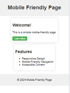
Mobile View
Open the index.html file using developer tools in your browser settings or open it from your mobile device, you should have something link this:

